
Here’s a closer view of a part of it:
If you’re interested in exploring philosophy’s place in the larger “co-assignment galaxy,” go here.
The posters were designed by Nadieh Bremer.
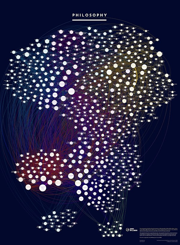
The Open Syllabus Project (previously) collects and analyzes data about course syllabi and the readings professors assign.

The project has recently started selling discipline-specific prints to support their work. They present a visualization of the roughly 600 most-assigned texts. Each dot represents a text, with its size indicating how often it is assigned. Clustering and colors of the dots represent how often they’re assigned together. Here’s the philosophy one:
Joe Karaganis, director of the Open Syllabus Project, says, “In addition to being gorgeous, our bet is that they are also instructive for students looking to develop an overall grasp of complex fields.” You can learn more about the visualization and purchase it here.


